VIAVI’s Product Pages
VIAVI is a global provider of network test, monitoring, and assurance solutions for communications service providers, enterprises, and network equipment manufacturers. They also develop optical technology used for a range of applications including material quality control, currency anti-counterfeiting, and 3D motion sensing.
The goal of VIAVI’s product pages is to turn visitors into prospective customers, but after analyzing their conversion rate data from the past 5 quarters, revisiting their product page experience became a top priority of mine.
My challenge was to design a product page that works well for all of VIAVI’s business sectors and also is flexible enough to support a wide range of stakeholder requests.
-
Both of the following initiatives informed and led design and interaction decisions. Feedback was also gathered during user interviews, and data was pulled from HotJar and Google Analytics.
Benchmarking Committee:
• 4 members
• 120+ companies researched (competitors, partners, inspiring companies, and customers)
• 21 website elements evaluated
Persona Development:
• 9 interviews with program leads
• 7 customer sectors
• 11 persona types developed
-
After conducting our competitive analysis, usability tests, and user interviews, I discovered the following experience issues:
• Low relevance for the user journey through VIAVI’s navigation
• Lack of engagement on product images
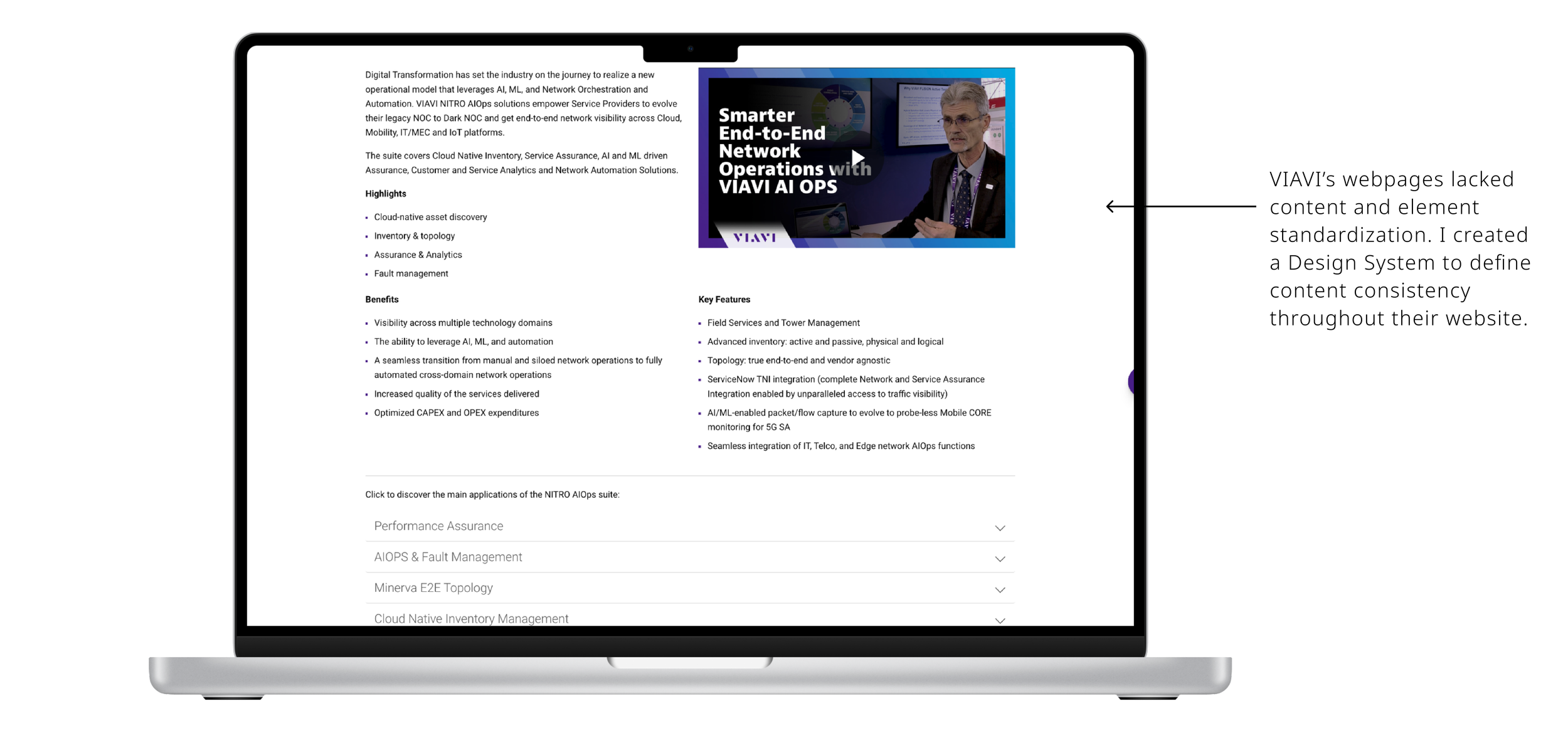
• Low relevance to standardizing asset displays
• Little attention to important CTAs used to continue the purchasing process
-
Considering the pain points and raised opportunities, I worked with our web developer and art director to explore different design alternatives. After investigating how other relevant companies in the industry designed similar experiences, we began sketches that acted as a starting point for our future agile working sessions with stakeholders from other teams.
After analyzing and adopting feedback received in the co-creation sessions, we developed a high-fidelity prototype (created in Adobe XD) to collect user feedback through a few rounds of usability tests.
We intended to verify users’ comprehension of the visual and interaction elements that we were proposing. Through these tests, we found a few opportunities to further iterate and improve on. Once implemented, our new page template was live for users to begin using.
-
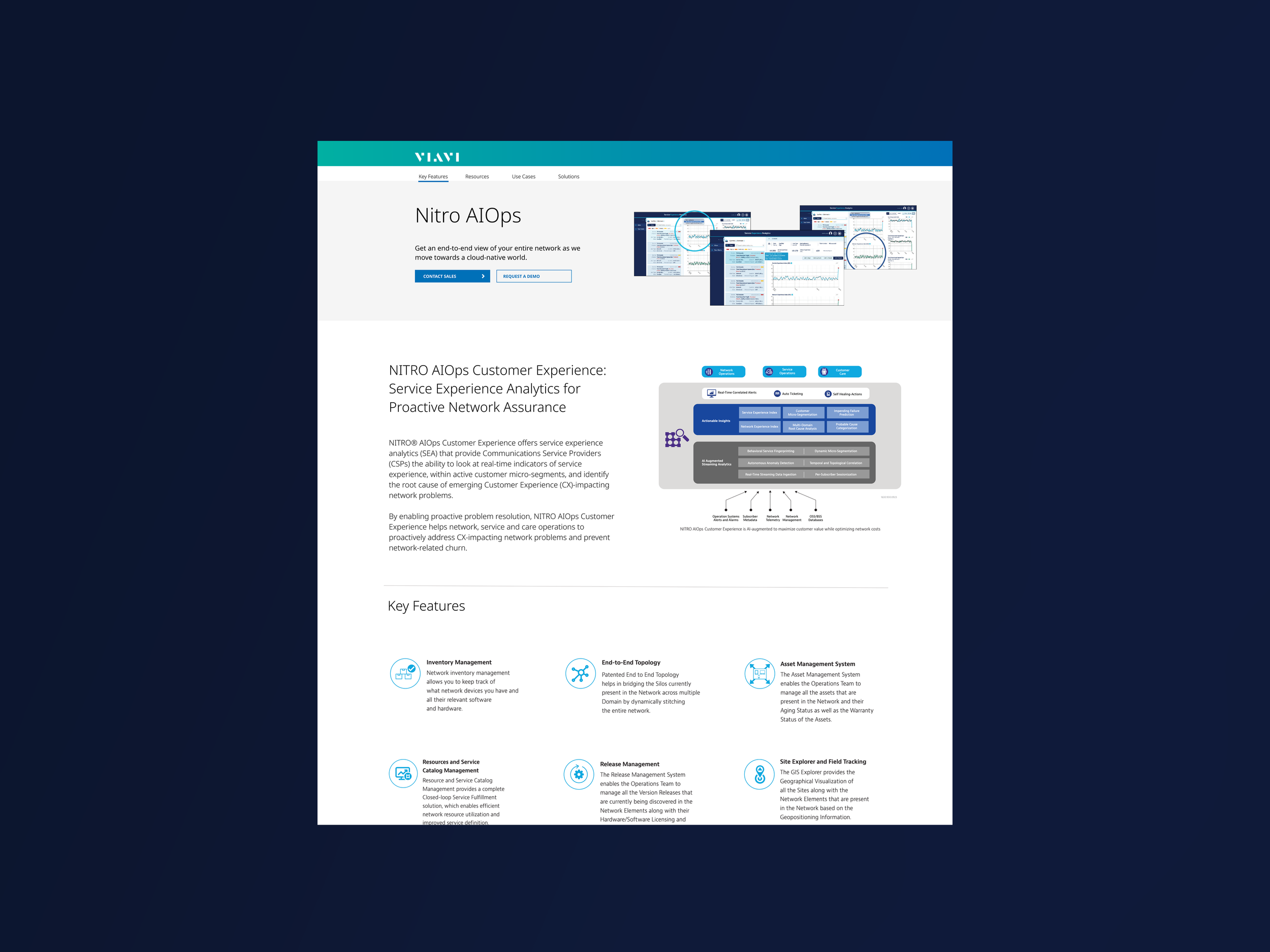
Our new design provides a high-level overview of the product and allows new visitors to quickly interact with the product’s key features and specs. It also allows existing customers to quickly see what is new in their product lines and provides updates on key areas VIAVI wants to promote.
With these interface and information architecture improvements, we observed the following results:
• 23% more requests made for quotes and demos
• 12% more page visitors
• 8% more users contacting sales
• 6% more sales
Before
After
Before
After


