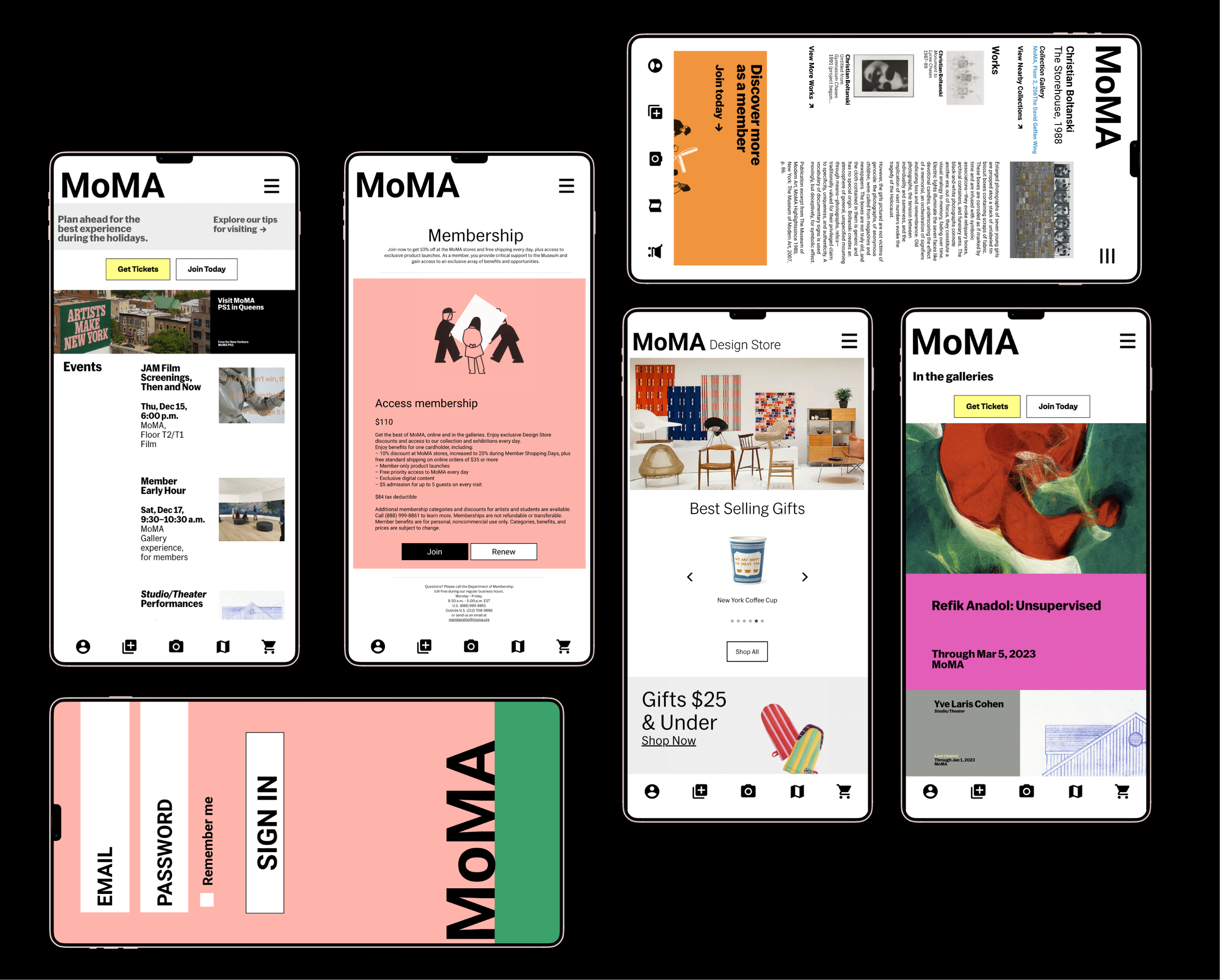
The Museum of Modern Art mobile application
The Museum of Modern Art in New York City is one of the best known art museums in the world with its constantly evolving modern and contemporary collection which contains almost 200,000 works. Even with its fame, the MoMA does not have a mobile application which created an opportunity for conception.
Exibition experiences using QR codes help bridge the gap between the online and offline dichotomy, expanding engagement in both experiences. Embracing technology through intuative mobile features, including QR codes, is the goal of this case study.
My impact:
Created a mobile application that utilized QR code features
Designed an intuitive navigation for users to learn more about MoMA’s art
Created a cohesive design from the MoMA’s website onto the mobile prototype
Research
To understand other museums’ digital footprints, a competitive analysis was conducted of three of the MoMA’s competitors — The Art Institute of Chicago, The Met, and The Guggenheim. It was found that all three museums offer many additional features in their desktop experience, but only include the following in their mobile experiences:
10 users were interviewed between the ages of 20 and 73 and were asked questions based on their museum experience, mobile application experience, and QR code experience. User interviews identified desires for mobile museum experiences and defined desired elements to be included within the mobile app.
60% of interviewees go to a museum at least once a year
80% of interviewees have used a museum’s mobile application during their visit
40% have virtually toured a museum, all during quarantine
100% of interviewees have used QR codes and find them to be useful
Data was synthesized and a persona was designed to highlight the target audience based on findings. A site map, to visualize necessary navigation elements, was then created.
Design
A collaborative design studio began the design phase, where ideas were sketched before being shared amongst fellow UX designers. This process allowed the designs to naturally become more robust. To keep the UI and brand feeling cohesive across both MoMA’s website and mobile application, current design elements were noted and utilized:
Content hierarchy through variations of MoMA Sans, which is designed with angled stroke terminals, distinctive forms, and a full range of font weights
Use of brand-aligned colors and imagery in a standard card structure
Prototype
Before prototyping the next iteration, 8 user tests were conducted with the prototype shown above. The goal was to test the application’s navigation and overall usability to validate the design before spending resources on the next phase of prototyping.
With user testing the objectives validated were:
Users can intuitively navigate through the app using the navigation options
Users can utilize the QR feature to gain insights into particular pieces of art
Users can easily sign in or sign up
Testing also revealed that users navigated through the navigation seemingly easily, but discussed that they were uncertain about the meanings of some icons. Based on this feedback, there was a clear direction for polishing the experience with the next iteration.
Digital design relies on information architecture to organize, structure, and design layouts. When scaling down designs from web to mobile screens, the limitations created with smaller display sizes make information architecture a key component in designing successfully.
Breaking up content into a left + right-hand structure visually separates copy from action items and allows the eye to digest the content more fluidly.
Prominent CTAs and hyperlinks that utilize bold colors and consistent placement, allow users to easily navigate through content


